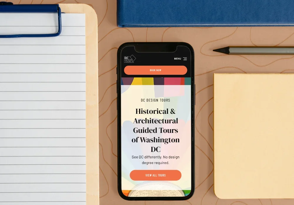
DC DESIGN TOURSBrand Refresh & Website Redesign for Washington DC Tour Company
Project/Client:DC Design Tours
Location:Washington DC, USA
Industry:Tourism
Services:Brand Guide and
Website Redesign in Wordpress
Hover/swipe to scroll homepage ↓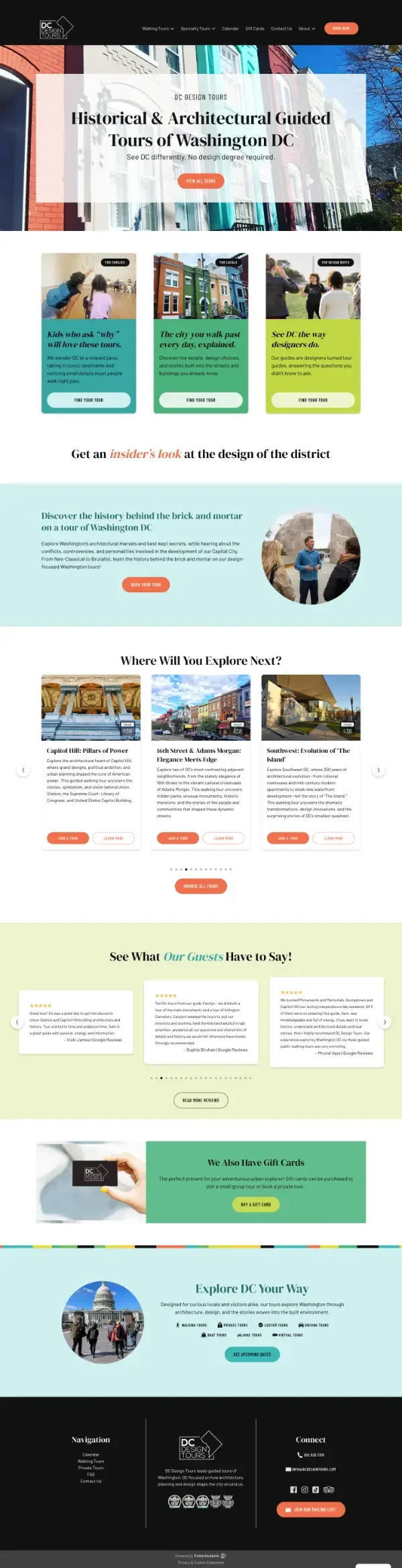

The Result (the good stuff first)
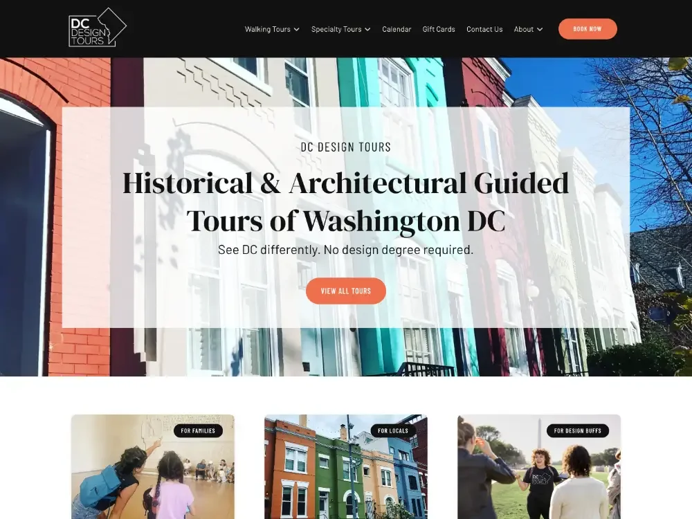
The redesigned DC Design Tours website now reflects the energy, creativity, and personality behind the company’s walking tours. A refreshed visual identity, new homepage design, and updated messaging help position the tours as engaging experiences for everyone—not just architecture and design enthusiasts.
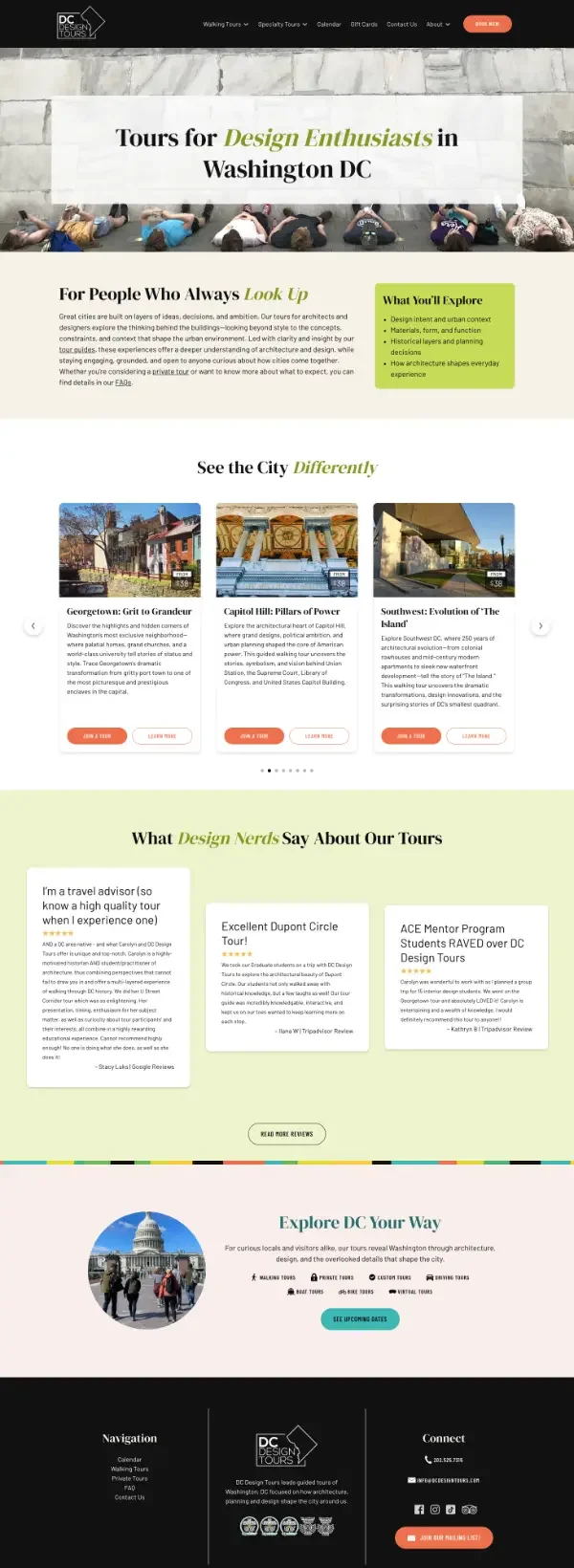
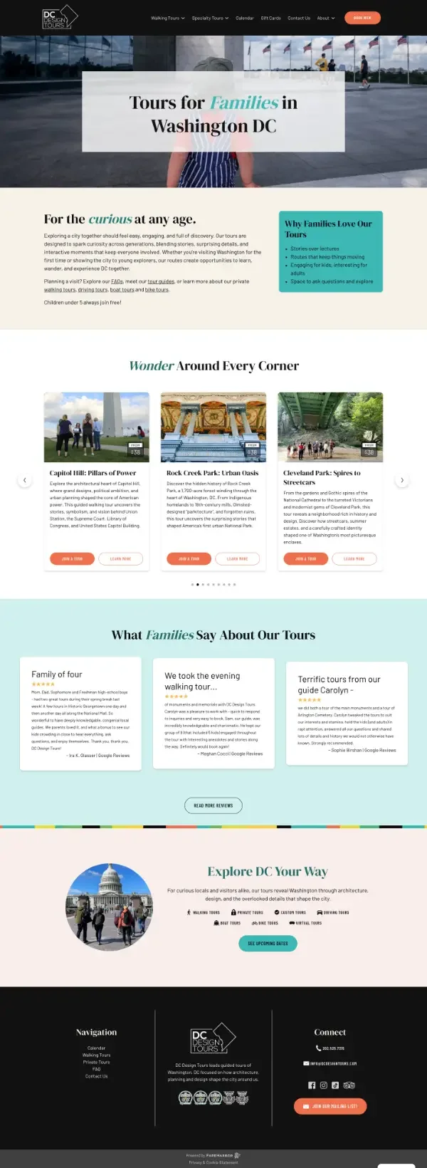
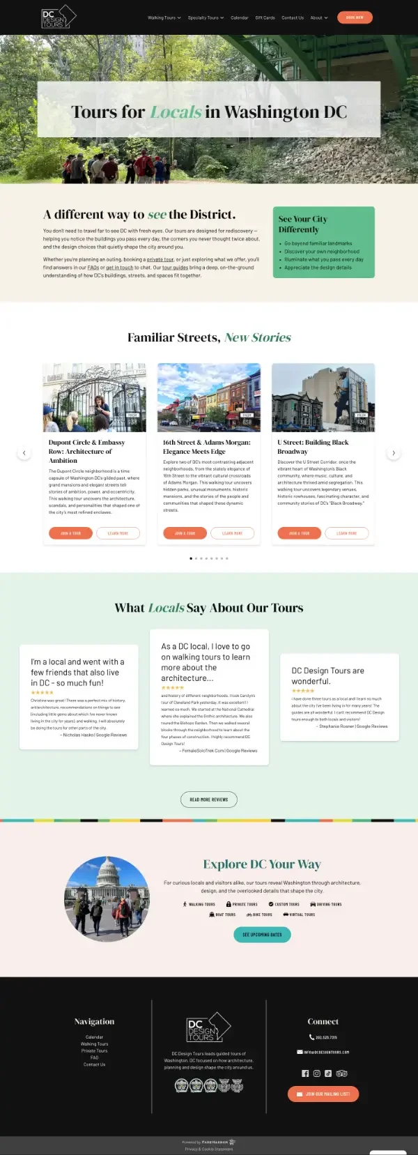
Despite working within the limitations of the FareHarbor platform, the site now feels more vibrant, approachable, and aligned with the experience customers have on the tours. New audience-focused landing pages make it clearer who the tours are for, while improved visuals, typography, and copy create a stronger connection with potential customers. The client now has a refreshed brand direction that can be carried across future marketing and social media efforts.
The Problem
The existing website was functional and performing well from a marketing and SEO perspective, but it no longer represented the personality or vision of DC Design Tours. The design felt outdated and lacked the energy, color, and storytelling that make the tours unique.
A key challenge was working within the constraints of the existing FareHarbor platform, which provides ecommerce ticketing functionality for tourism companies but offers limited design flexibility and no direct backend access for the client. While a fully custom, self-hosted website would provide more control long-term, the decision was made to improve the current platform while staying within budget and timeline constraints.
Beyond the visual design, the messaging needed to shift. The previous website unintentionally positioned the tours as specialized experiences for people with architecture or design backgrounds. In reality, architecture and design are simply the framework for telling fascinating stories about Washington DC, making the tours enjoyable for families, locals, and visitors of all backgrounds.
The Approach
The project began with a mini brand refresh and a complete redesign of the homepage. After learning more about Carolyn, the owner, and the guides behind the tours, the focus was on bringing more personality, warmth, and excitement into the website experience.
The existing logo was preserved to maintain consistency with printed materials and existing brand assets. The previous website color palette was replaced with a brighter, more playful collection of colors inspired by the vibrant rowhouses of Washington DC. New typography, photography direction, and a refreshed tone of voice helped create a brand that feels more welcoming and experiential.
The homepage carousel was redesigned with a curated selection of close-up architectural and design-focused photography that highlights unexpected details of Washington DC. Instead of traditional tourist snapshots, the imagery focuses on unique perspectives—colorful murals, architectural details, spiral staircases, and vibrant rowhouses—to spark curiosity and create a stronger emotional connection. Tour photography was integrated throughout the tour pages, allowing the homepage to focus on discovery and intrigue.
The website copy was strategically updated to balance brand storytelling with SEO performance. High-performing content that was already bringing in search traffic was preserved where appropriate, while new emotional and engaging copy was introduced in key areas to better connect with visitors and communicate the unique experience of the tours.
Three new landing pages were created to speak directly to different customer groups, helping visitors quickly understand which experiences are right for them. Global styles were also updated throughout the site to create a more cohesive look and feel.
Because of FareHarbor’s platform restrictions, some custom CSS updates required coordination with their support team rather than direct implementation. The design was carefully adapted to work within these limitations while still achieving the desired visual direction.
Outcome and Feedback
The website now better captures the fun, creative, and welcoming experience of a DC Design Tours adventure. Visitors can more easily understand who the tours are for, what makes them unique, and why they’re worth booking.
The redesign successfully delivered the highest-priority improvements while staying within budget and working around the limitations of the existing platform. The client now has a stronger digital presence and a refreshed visual direction that can extend into future marketing efforts.
Future phases will focus on improving the overall site structure, navigation, and organization of tour information to make it even easier for visitors to find the perfect experience.
“Since she revamped our homepage, we've seen increased user engagement, and we're excited to continue working with her on future enhancements. I highly recommend Lindsey to anyone looking for a thoughtful, talented, and reliable web designer.”
— Carolyn Muraskin, OWner DC Design tours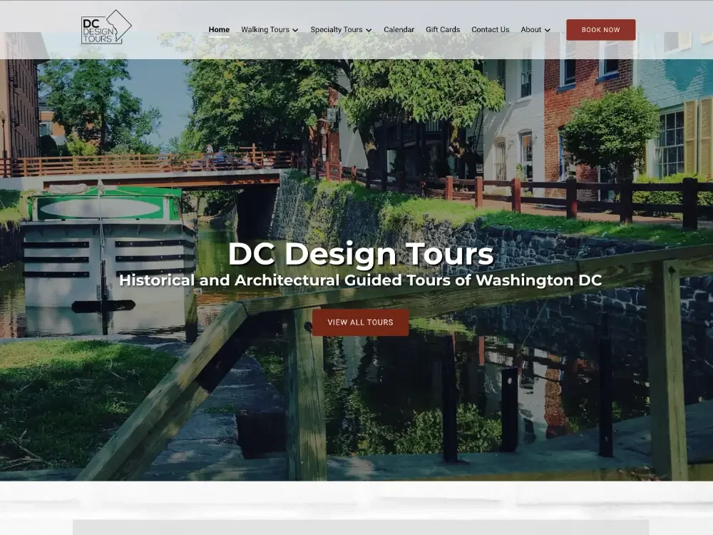
Website Before & After